The pavilion acts as an information kiosk and cafe for the regenerated area of Battery Park.
A N N A _ H O L S G R O V E
Saturday, 5 November 2011
Friday, 7 October 2011
Folding Spaces
The aim of the project was to create an object from paper, which would advertise the Architecture School to other students at the university. The chosen site for 'Folding Spaces' is a transitional space and a key route between the library and the rest of the campus, enabling the maximum number of students to interact with the piece.
Folding Spaces is a textural work drawing attention to the combination of natural and artificial lighting in the tunnel, and causing its users to reconsider their path through the space.
Tuesday, 6 September 2011
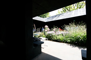
Serpentine Gallery Pavilion 2011: Peter Zumthor
The concept behind Zumthor's design was to create a sanctuary away from the noise and the chaos of the city, a garden within a garden.
Approaching the site, the pavilion was much less obvious than last year's, hidden away in the shadow of the trees. It appeared to be classic understated Zumthor, an area in which Nouvel received much criticism last year.
The design of the corridors, combined with the sloping roof, blocked out sound aiming to create the peaceful garden at the heart of the structure. However, I felt it had the opposite effect as most of the people in Kensington Gardens were concentrated into this small space, making it noisier and more chaotic that the area outside.
As a building, it is far more sophisticated and refined that last year's pavilion, but I can't help feeling that Nouvel made better use of the space and the setting.
Serpentine Gallery Pavilion 2010: Jean Nouvel
Before visiting this year's pavilion, I decided to refresh my mind about the 2010 competition winner.
Jean Nouvel's pavilion was based on the colour of red that you see when closing your eyes after looking at the sun. The structure had an element of playfulness, with table tennis, chess and kites, whilst onlookers were able to watch from the (overpriced) cafe.
Sunday, 4 September 2011
Maggie's, London: Richard Rogers
Having visited the Maggie's exhibition at the V&A a few months ago, I was delighted to come across one of the cancer care centres by chance, whilst cutting through Charing Cross hospital.
"It is like a house which is not a home, a collective hospital which is not a institution, a church which is not religious, and an art gallery which is not a museum."
Westfield, London
I don't like the claustrophobic feeling created by shopping malls, but the design of Westfield makes it better than most. It was first drawn to my attention by Channel 4's 'The Secret Life of Buildings', which focussed on the design of the ceiling. As well as providing plenty of natural light, the curved structure and triangular panels cause dappling light which creates a glittering effect and encourages shoppers to keep looking around.
Sunday, 28 August 2011
Subscribe to:
Comments (Atom)


